Dashboards
Dashboards are where you can get business insights from your data. They have a title and a collection of data visualizations grouped together to support decision making. Dashboards are pre-configured using the Quick Intelligence Designer but can be modified to meet your current needs.
Visualizations can be single KPIs, charts, or tables. Any of the visualizations can be edited with their ... menu. We will discuss editing visualizations in the Quick Intelligence Designer section. With the ![]() button you can see more context or make more space for the visualization.
button you can see more context or make more space for the visualization.
By clicking on any items in the visualization, you can either see a further breakdown of data or drill-down into the underlying data.
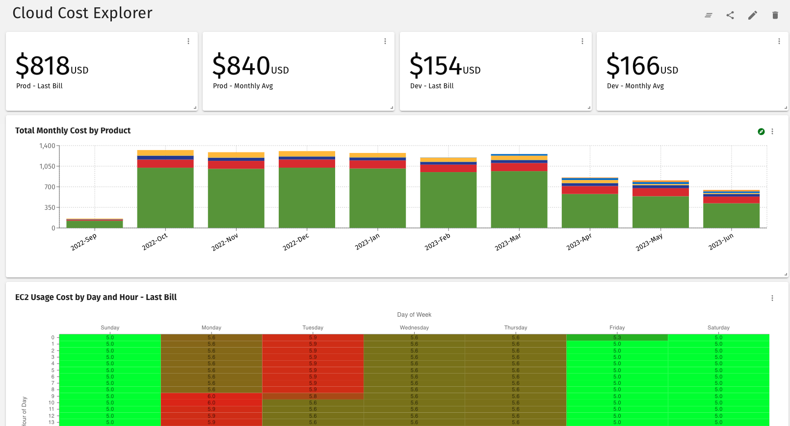
You start with the Cloud Cost Explorer dashboard...
If you click on one of the months in the Total Monthly Cost by Product visualization you will see a more detailed breakdown of the cost by product for that month. If you then select one of the products and drill-down by instance type, you will see the following breakdown for each type of instance.

You can then drill down by region or another meaningful attribute. ... and so on, extracting new business insights and imagining new questions you want to go back and ask of your data.
As you drill-down into your data you can return to any previous level using the Export to .png feature. In addition to exploring your dashboard data using drilldown, you can rearrange dashboard visualizations with resize and drag-and-drop. You can also export the underlying data to Excel or Sheets using the .csv format or save your visualization to .png format to use later.
Another great thing about dashboards is that you can use them in Quick Intelligence or embed them in your own app or web page.